Source code
The Code Metrics Dashboard provides a comprehensive overview of your project's source code health and evolution. Designed for software developers and team leads, this section offers actionable insights into code quality, complexity, and change patterns. By visualizing key metrics, the dashboard helps you identify areas for refactoring, monitor technical debt, and track the impact of development practices over time.
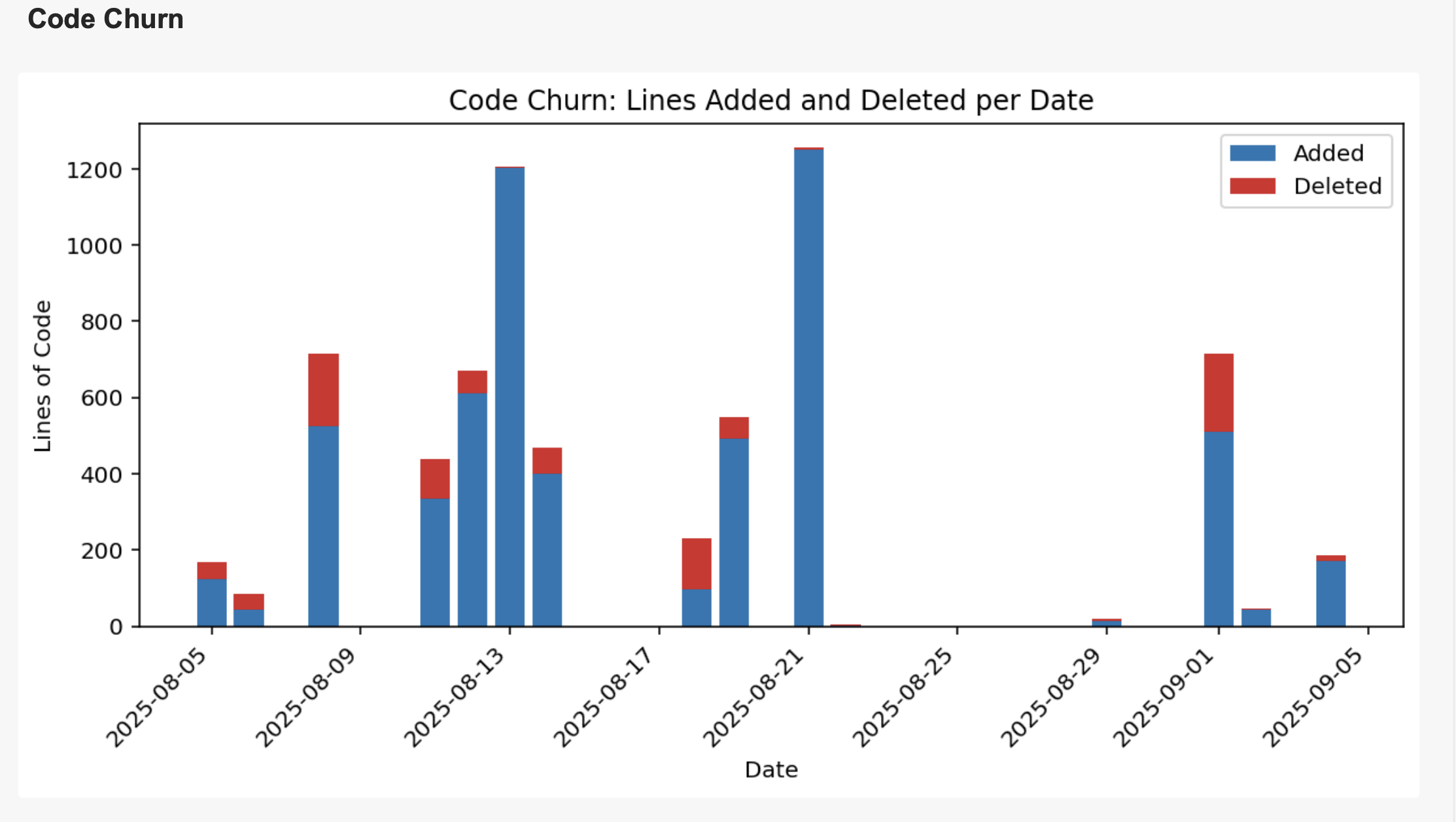
Code churn
A stacked bar chart showing the total number of lines added (blue) and deleted (red) across the entire repository on a given date.
Type of Chart
Stacked bar chart showing lines added (blue) and deleted (red) per day.
Insight Provided
Reveals the rhythm of development activity, highlighting periods of intense work, refactoring, or inactivity. It helps you spot major events and understand the overall pace of your team's coding efforts.
Example Usage
Use this chart to identify when large features were merged, when refactoring happened, or to monitor the impact of sprints. For example, a spike in both additions and deletions may indicate a major refactor.
How It Computes and Filters
Aggregates commit data by day, counting lines added and deleted. You can filter by date range and interact with the chart to see which commits contributed to the churn on a specific day.
Entity Churn
Entity churn reveals which files in your project are changed most often. This chart helps you pinpoint hotspots—files that may need refactoring, more tests, or architectural review. With powerful filtering options, you can exclude generated files or focus on the top N most frequently changed files. This makes it easy to find areas of your codebase that require attention and improvement.
, showing the top N most frequently changed files")
Type of Chart
Bar chart showing code churn by file, focusing on the top N most frequently changed files.
Insight Provided
Pinpoints hotspots in your codebase—files that are changed most often. This helps you identify candidates for refactoring, more tests, or architectural review.
Example Usage
Use this chart to find files that are frequently modified, which may need attention. For example, if a configuration file is always changing, it might be a source of bugs or instability.
How It Computes and Filters
Counts lines added and deleted per file, then ranks files by total churn. Filtering options let you exclude generated files, vendor directories, or focus on the top N entries for meaningful insights.
Entity Effort
The entity effort chart shows how much work has gone into each file, measured by the number of commits. This visualization helps you understand which files are under constant development and which are more stable. Use this chart to identify files that may be over-engineered, need simplification, or are critical to your project’s success. The treemap format makes it easy to see the distribution of effort at a glance.
 for a given file.")
Type of Chart
Treemap where each rectangle's size represents the number of commits for a file.
Insight Provided
Shows which files require the most effort and attention, helping you spot files under constant development or those that are more stable.
Example Usage
Use this chart to identify files that are frequently updated, which may be critical or over-engineered. For example, a README.md with many revisions may indicate evolving documentation needs.
How It Computes and Filters
Counts the number of commits per file and visualizes the distribution. You can filter by file type or directory to focus on specific areas of your codebase.
Entity Ownership
Entity ownership highlights who has contributed to each file, showing the breakdown of changes by author. This chart is invaluable for understanding code expertise and team collaboration. It helps you quickly find out who to ask for help or a review on specific files, and supports onboarding by making team knowledge visible. The chart is interactive, allowing you to explore contributions and filter by author or file.

Type of Chart
Stacked bar chart showing lines changed per file, broken down by author.
Insight Provided
Highlights code ownership and expertise, making it easy to see who contributed most to each file. This supports collaboration and onboarding by showing who to ask for help or reviews.
Example Usage
Use this chart to identify the main contributors to critical files, or to balance code ownership across the team. For example, if one author owns most of a security module, ensure others are familiar with it too.
How It Computes and Filters
Aggregates lines added and deleted per file, attributing changes to each author. You can filter by author, file, or date range, and interact with the chart to explore contributions in detail.